Client Challenge
Where they were stuck
- Over a third of revenue was being handed to marketplaces every month.
- The kitchen juggled tablets from three different platforms during service.
- There was no way to reward loyal, repeat guests directly.
One app, one kitchen, every table and every doorstep — perfectly in sync.
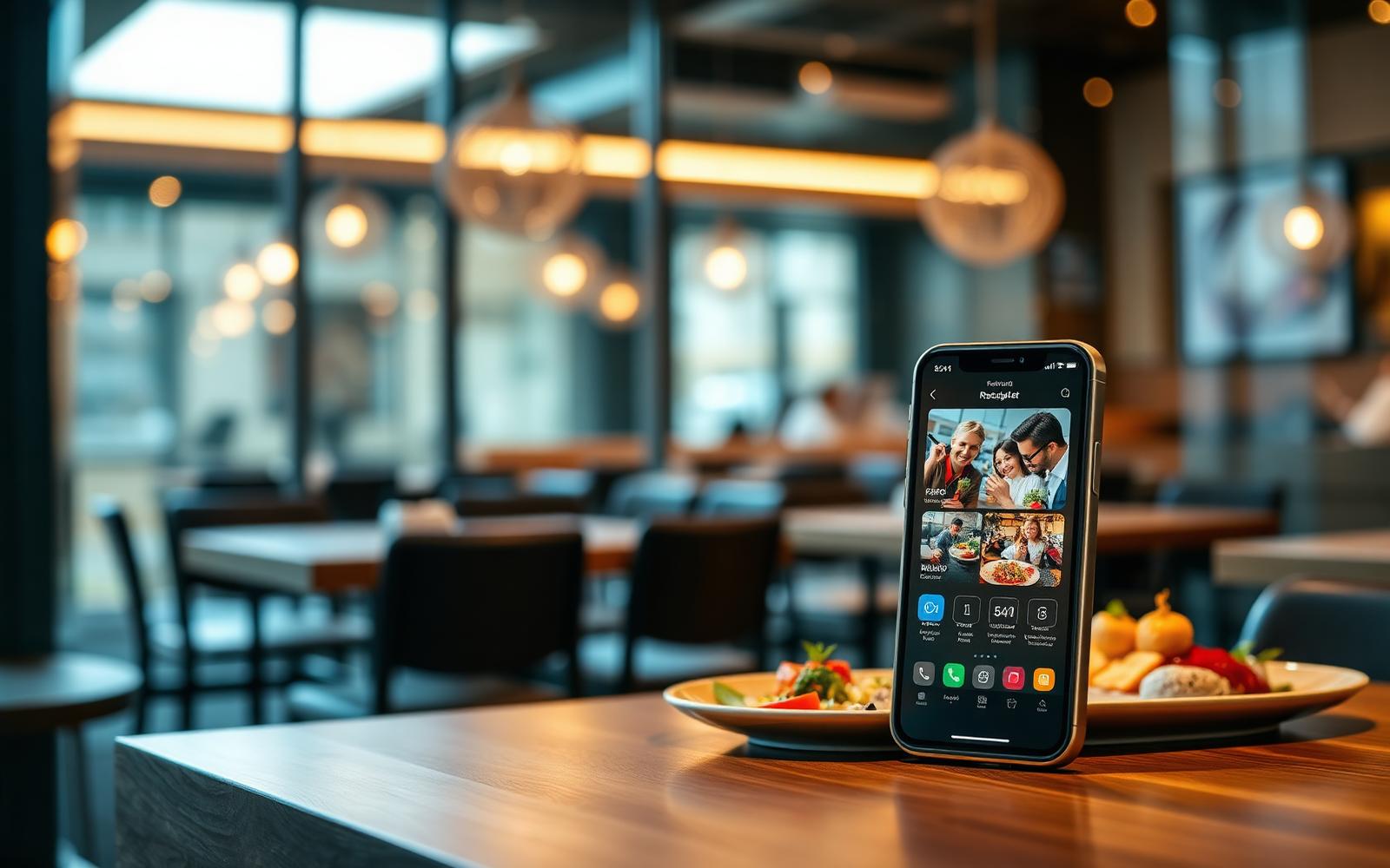
A growing restaurant group was paying heavy commissions to third-party platforms and losing the direct relationship with their guests. We built their own branded ordering app — dine-in, pickup and delivery — with a single kitchen view for staff.
The restaurant group that hired us was not struggling for guests. They were struggling for margin. Every month, a punishing share of revenue was disappearing into marketplace commissions, and the kitchen was serving orders from three different tablets during peak service. This is the story of how we helped them take the guest relationship back — and calm their kitchen down in the process.
The economics of third-party ordering platforms are well documented. What is less often discussed is the operational chaos they introduce inside a working kitchen. During a Friday dinner service we watched a single expeditor try to reconcile orders arriving simultaneously on three tablets, each with different modifiers, different timings and different fulfilment rules. Mistakes were inevitable. Refunds were routine.
Leadership already knew that first-party ordering would improve margin. The harder question was whether they could deliver an experience their regulars would actually prefer over the platforms they had grown used to.
We spent two weeks embedded in the flagship venue. We took orders at the pass, ran food, worked the floor, and — with permission — watched dozens of guests order on their phones. We learned that the platforms were not winning on love; they were winning on habit. Guests defaulted to what was familiar and painless.
So our brief became specific: build an ordering experience so quietly good that it becomes the new default. Not flashy. Not novel. Just faster, calmer and more obviously theirs.
"The platforms were not winning on love — they were winning on habit. Our job was to make the group's own app the new default."
Most branded restaurant apps make the mistake of designing three parallel experiences. We designed one. A guest scans a QR at the table, opens the app for pickup, or orders delivery — and lands in the same trusted flow, with the same menu, the same modifiers, the same payment sheet.
Under the hood, the differences matter. Dine-in orders route straight to the kitchen with the table number attached. Pickup orders schedule against real capacity. Delivery orders check the guest's address against a serviceable radius before the menu even loads. But to the guest, it feels like a single, coherent app.
The kitchen display was, in many ways, the most important surface in the whole project. It replaced three tablets and a printer with a single, calm queue that consolidates every channel.
We designed it with the head chef, not for him. Ticket density, colour cues, timing bars, and bump behaviour were all iterated on the pass, in service. The final version reduced the average ticket handling time noticeably and — more importantly — reduced the number of ticket-related raised voices per shift, which is the metric that actually matters in a kitchen.
We resisted every temptation to bolt on a heavy loyalty programme with tiers, badges and gamification. Restaurant guests do not want to be gamified; they want to feel recognised.
The loyalty layer we shipped is deliberately understated. Regulars are quietly rewarded. Birthdays are quietly remembered. The app never nags. The result is a programme that guests actually keep, and one that turns opt-in data into a real, ownable relationship instead of a marketing gimmick.
We piloted at the flagship for a full month before touching any of the other venues. Every issue that surfaced — a modifier that confused first-time guests, a timing rule that pushed pickup orders too tightly — was fixed before extending. By the time we rolled out to the remaining locations, the platform had already been hardened by a live audience.
Training the front-of-house teams took less than a morning per venue. The system had been designed so that a new host could learn it in minutes, not days.
The clearest signal of success came, unexpectedly, from a Tuesday-night regular at the flagship. He told the manager, offhand, that he now orders through the app 'because it's just easier than the other one.' That was the whole brief, in one sentence — and that is the sound of a guest relationship coming home.
Spent full shifts in kitchens and front-of-house to understand the real workflow.
Tested paper and clickable prototypes with actual guests and staff.
Shipped the app, kitchen view and integrations in tight two-week increments.
Piloted at the flagship venue, then extended to remaining locations.
Regulars now order through the brand's own channel instead of marketplaces.
Ordering, paying and reordering feel effortless from any table.
Staff work from a single screen instead of juggling multiple tablets.
The group finally understands who its best guests are — and can reach them directly.
"The app has become the way our regulars order. Service is calmer, guests are happier, and we own the relationship again."
Book a working session with our senior team — we'll map your problem and a path to shipping in 30 minutes.