Client Challenge
Where they were stuck
- Reception was overwhelmed with booking and rebooking calls all day.
- Doctors had no clean view of their day across clinics.
- Patients had no way to book, reschedule or see their history online.
A calm, trusted way to book care — for patients, doctors and reception.
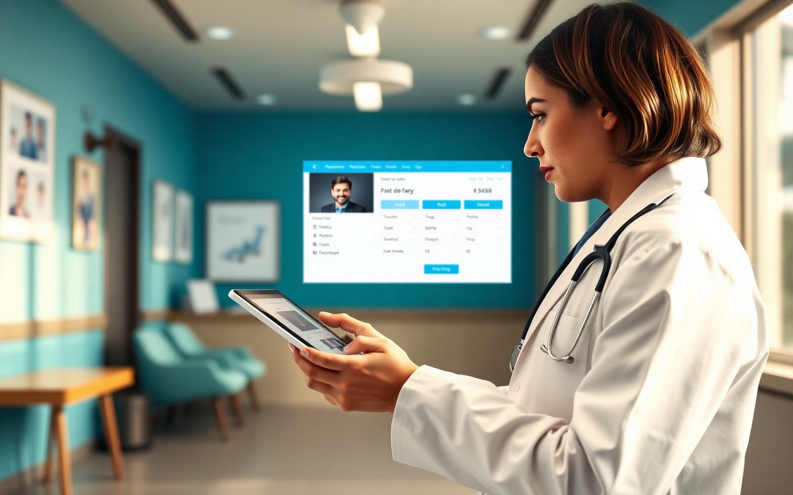
A multi-clinic healthcare group was managing appointments through phone calls, paper diaries and three unrelated tools. We designed a modern booking system for patients, doctors and reception — quiet, reliable and built with care.
Healthcare software has a bad reputation for a reason. It is often loud, cluttered, and built for administrators rather than patients. When a multi-clinic group asked us to design their new appointment system, our first commitment to them was that it would not feel like healthcare software. This is the story of how it turned out.
We began, as we usually do, on the ground. One of us spent two full days at the busiest clinic's reception desk. The phones rang almost without pause. Booking, rebooking, insurance queries, prescription follow-ups and general enquiries all landed on the same two people, who handled them with grace under noticeable pressure.
It did not take long to see what needed to change. The reception team were doing skilled human work — reassurance, judgement, warmth — interleaved with mountains of clerical work that should never have been theirs.
Every screen in the platform was designed against a single quiet principle: reduce cognitive load. Fewer colours. Fewer decisions per screen. A visible sense of what has just happened and what is coming next.
For patients, the booking flow was designed to feel more like booking a considered dinner than filing a medical form. For doctors, the day view was designed to hold everything they need for a shift and nothing they do not.
"Every screen was designed against one quiet principle: reduce cognitive load."
Healthcare products live or die on trust. We built ours in three deliberate places: clarity of information, safety of data, and honesty of communication.
Patients always see who they are booking with, what the appointment is for, and what happens next. Data is handled with care that matches the sector's requirements. Confirmations, reminders and rescheduling messages sound like a considered human wrote them, because one did.
The most requested feature going in was 'fewer no-shows.' The naive answer would have been to send more reminders. We resisted.
Instead we designed a small ladder of touchpoints — a booking confirmation, a considered day-before nudge, and a quiet morning-of reminder with a one-tap reschedule option. The result was a meaningful drop in no-shows without patients ever feeling harassed.
We piloted the system at one clinic for a month, then extended to the others in weekly waves. Each clinic had its own quirks — insurance mix, walk-in policy, referral flow — and we adapted the configuration rather than forcing uniformity.
Reception teams were trained on their own desks, during real hours, so that the first day of live use never felt like a first day.
The most telling change is a quiet one. The reception phones still ring, but they ring less often and, when they do, the calls are the human ones — the reassurance, the judgement, the warmth. Everything clerical has moved online, on the patient's time. Which, for a healthcare platform, is exactly what success sounds like.
Shadowed reception, doctors and patients to design around the real flow.
Prototyped the patient and clinician journeys in parallel.
Shipped module by module with clinicians reviewing every change.
Trained reception and doctors, then supported live for the first month.
Staff can finally look up from the phone and greet patients properly.
Automated reminders keep the schedule tight without extra effort.
Booking, rescheduling and paying feel modern and trustworthy.
"Our reception team can breathe again. Patients tell us the booking experience is the best they've had."
Book a working session with our senior team — we'll map your problem and a path to shipping in 30 minutes.