
Client Challenge
Where they were stuck
- Beautiful architecture was being represented by a tired, template site.
- Every project update needed a developer.
- There was no clean way to capture qualified enquiries from serious buyers.
A showroom for property that finally does the property justice.
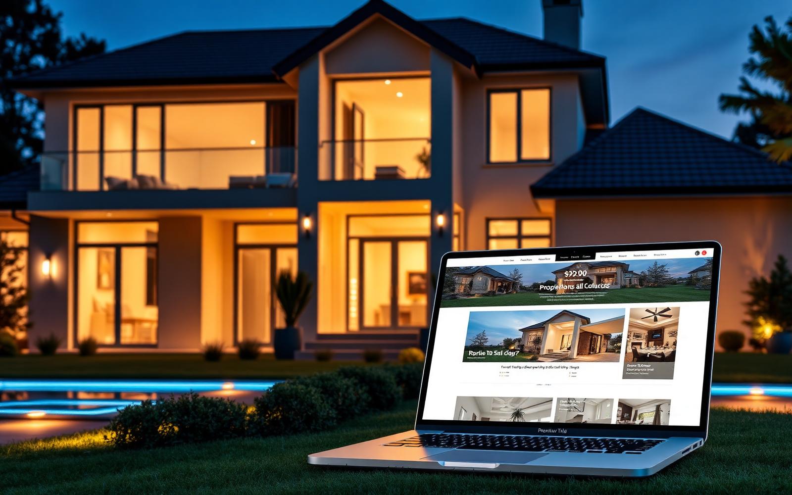
A boutique property developer needed a website worthy of the homes they build. We designed a considered, editorial experience that lets each project breathe — and quietly captures serious enquiries.
A boutique developer's website should feel like walking into their showroom: quiet, considered, and quietly confident. This one did not. It felt like walking into a hurry. This is the story of how a six-week rebuild gave a developer the digital showroom their architecture had always deserved.
The developer had built a reputation on restraint. Their homes were architecturally rigorous, generously proportioned and photographed with care. Their website, unfortunately, was none of those things. It was a tired template with slow galleries, inconsistent typography, and enquiry forms that treated every visitor as if they were the same person.
The founders knew the disconnect was costing them. Serious buyers were arriving through the front door of a showroom that did not match the front door of their website.
The design brief was clear: this should feel less like a corporate property website and more like a well-edited architectural monograph. Restraint would do the heavy lifting. Photography would be given room. Typography would carry the tone.
We designed the property template first. Once that felt right, everything else — home, neighbourhood pages, journal, contact — was designed to support it rather than compete with it.
"Restraint would do the heavy lifting. Photography would be given room. Typography would carry the tone."
Enquiries were the site's single most important commercial function, but the previous form treated a serious end-buyer, a curious agent and a speculative investor identically. The result was a lead list the sales team did not entirely trust.
We designed a short, thoughtful enquiry flow that segments the buyer in two questions, then adapts what it asks next. The form never feels long. The sales team, for the first time, receives leads pre-sorted by intent.
Image-heavy websites tend to be slow websites. We refused that trade-off. Every image ships in modern formats with responsive sizes. The critical path is small. The pages are painted before a scroll begins.
This is not vanity. Buyers browsing on a phone in the back of a taxi do not wait for a hero image to load. If it is not there, they are not there.
New listings used to require a developer. Now they take minutes. The sales team drafts, photographs, publishes and updates each listing themselves, in a CMS that was designed around how they actually work.
The knock-on effect is speed to market. Properties that used to sit unpublished for days because 'the developer was busy' now go live the same day they are ready to be sold.
The website now sells the way the showroom sells — quietly, confidently, and without ever trying too hard. Enquiries arrive better qualified, updates land the same day, and the brand finally reads as the calibre of the homes it represents.
Defined the editorial voice and design language with the founders.
Crafted the property template first — everything else followed it.
Engineered a fast, image-heavy site that still scores top on performance.
Trained the team and stayed on for the first month of listings.
The brand finally reads as the calibre of the homes.
Segmented forms filter serious buyers from noise.
New properties go live the same day they are ready.
"The site now sells the way our showroom sells. Enquiries arrive better qualified, and our team can update everything themselves."
Book a working session with our senior team — we'll map your problem and a path to shipping in 30 minutes.